America Center
Choose the High Ground
Overview
America Center is a multiphase development in San Jose, CA. Coming in at 1.1 million square feet of state-of-the-art office space, it sits on 13 acres of land with unobstructed views of the San Francisco Bay and Valley.
With the completion of Phase II, our San Francisco marketing team at Cushman & Wakefield was brought in to develop a full print and digital campaign to highlight the two new 6-story buildings and accompanying amenity building.
View Website Skip to Results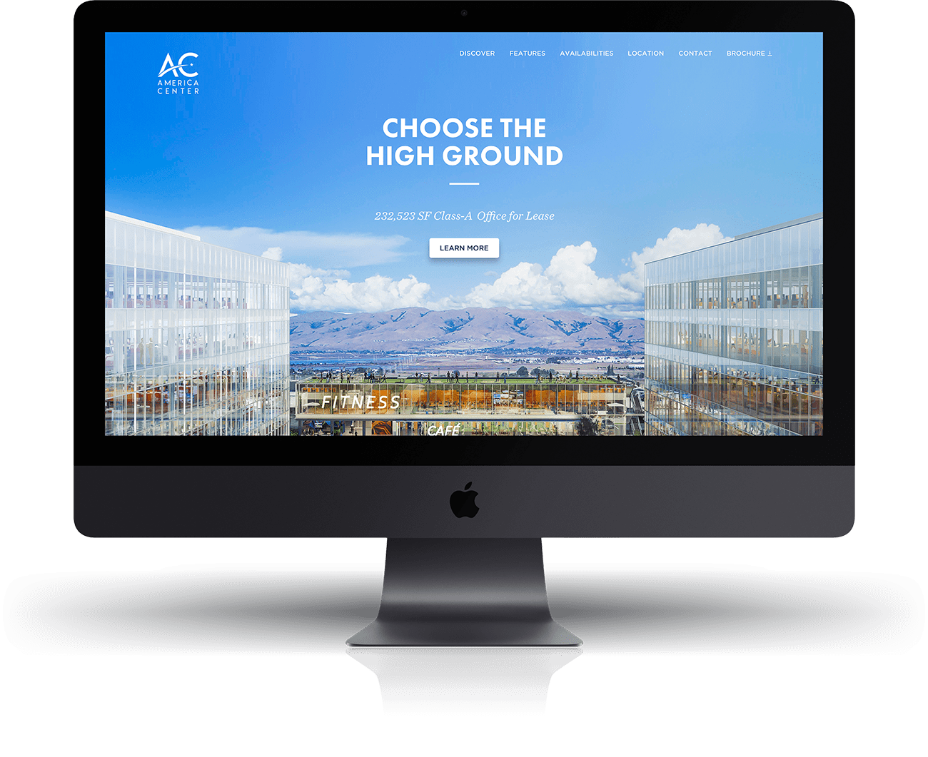
Challenge
Design
The challenge of this inherited project was creating a versatile and flexible marketing campaign that could be used for each phase of this development while remaining distinguishable from one another.
Development
The second challenge was ensuring a quick and seamless experience throughout the site without sacrificing accessibility or quality.
Process
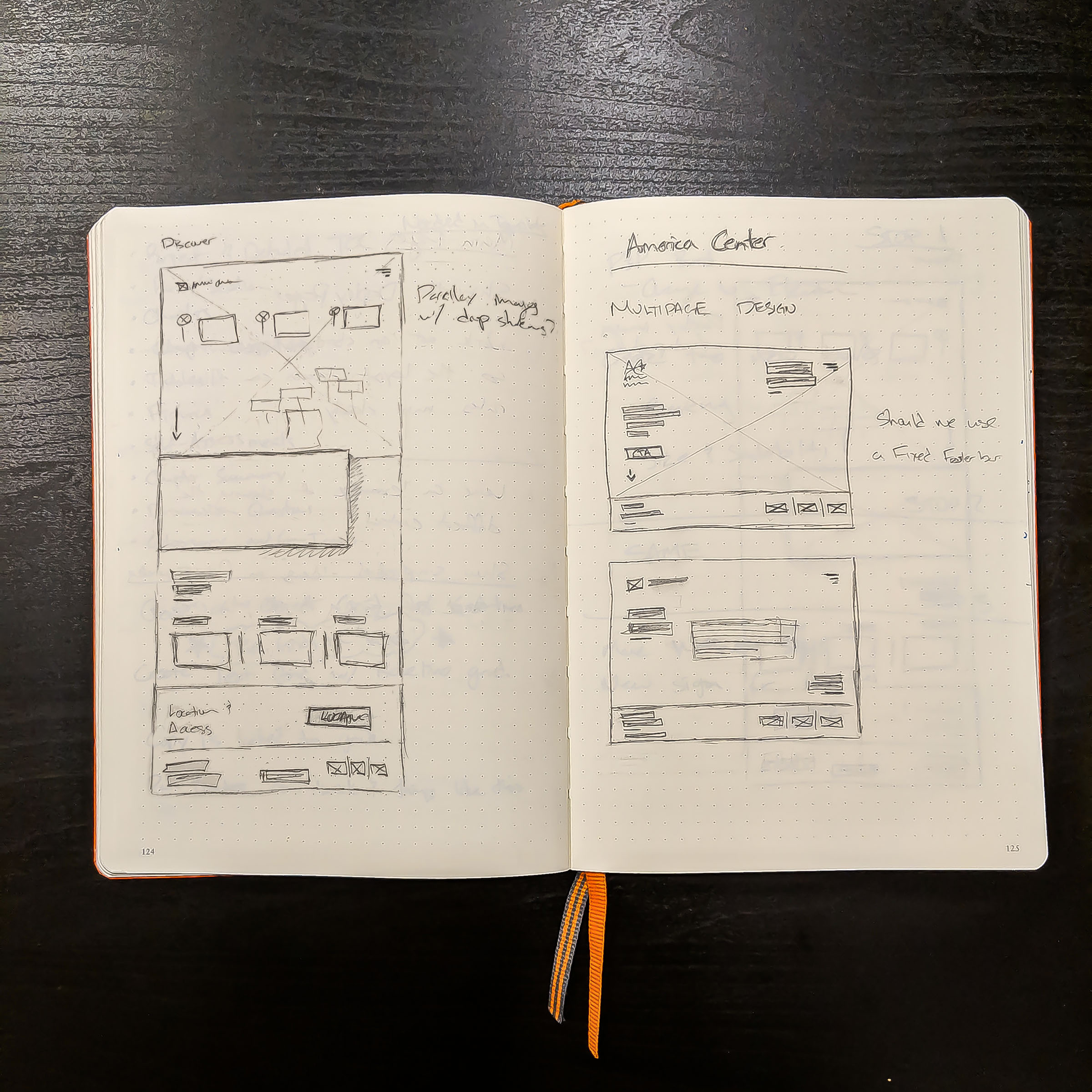
Design
Our team began working on the print material for Phase II including a brochure and environmental collateral for their marketing suite. We then further developed some key design elements that would be used throughout the campaigns for each phase.
Once this was established, we moved to design the website as well as a 10-part email campaign excluding announcements and special event collateral.
Development
After approval, I began bringing in the content from the brochure and rewriting the SASS for each component. One of the most difficult aspects of the site to build was the interactive map built into a tab structure.
After launching the site, we've undergone a few updates as floor plans change and details need updating.
Results
The result is a versatile and extensive campaign that we expanded to enable content to be displayed in new and refreshing ways across mediums while staying true to brand and message.
View WebsiteMobile
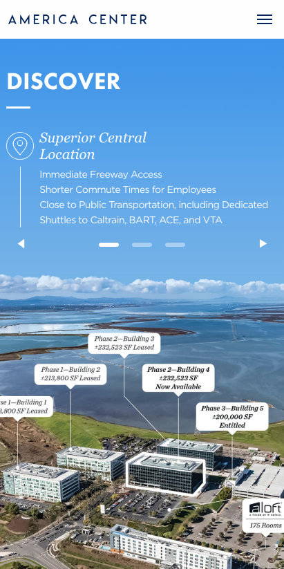
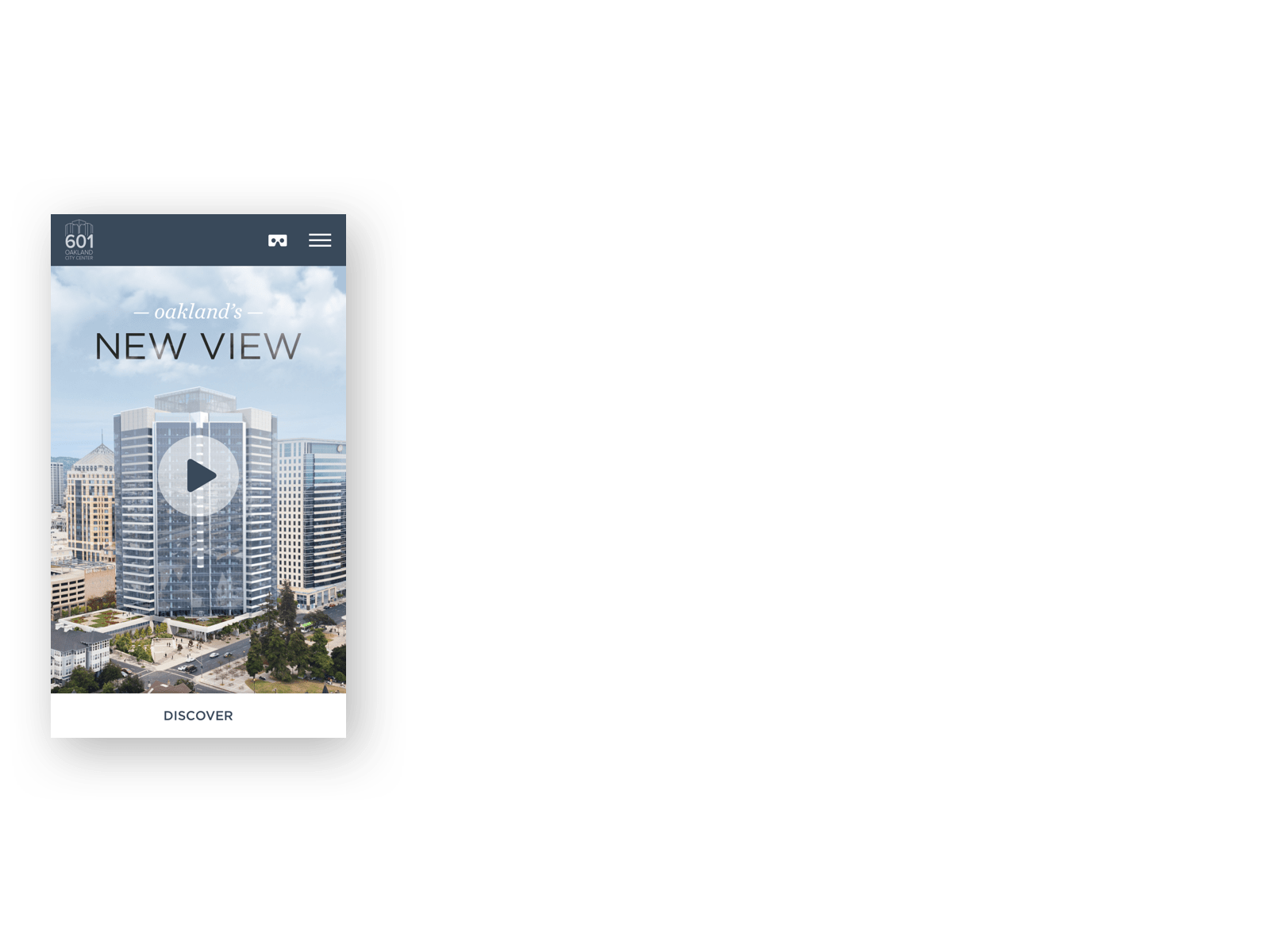
Layout utitlizes swiping to cycle through content on mobile.
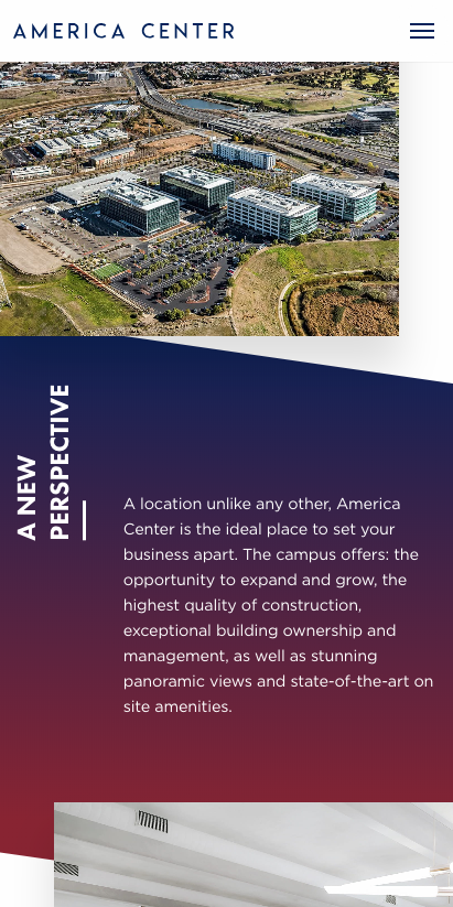
Mobile layout retains offset images with angled gradient background.
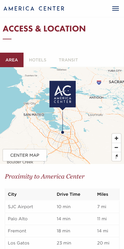
Interactive map uses 50% screen width on larger screens and switches to tabbed layout on mobile.
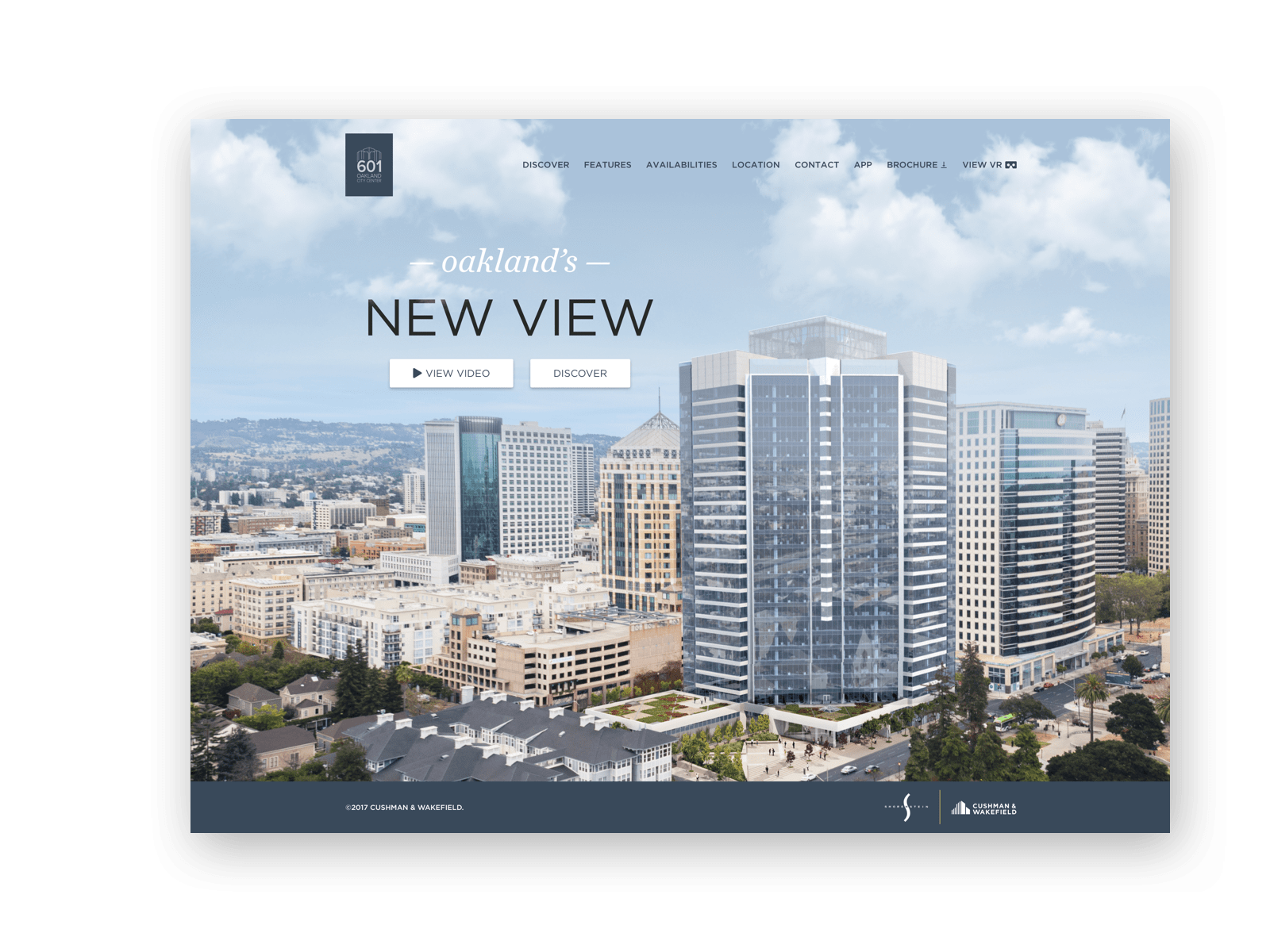
Desktop
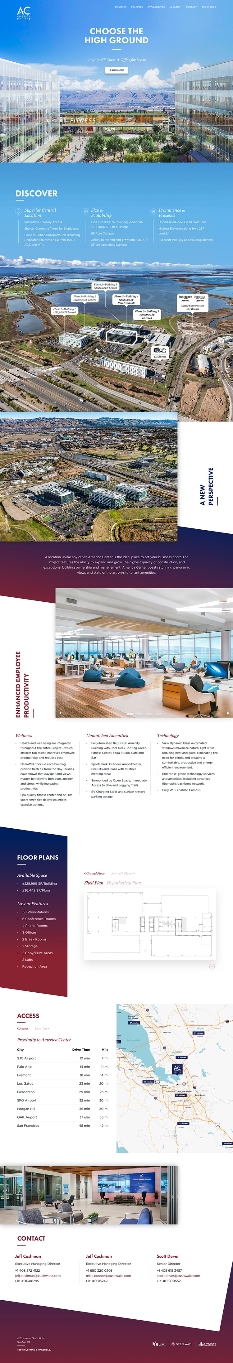
Single scrolling website design utilizing tabbed layout to organize multi-level content.
Email Campaign
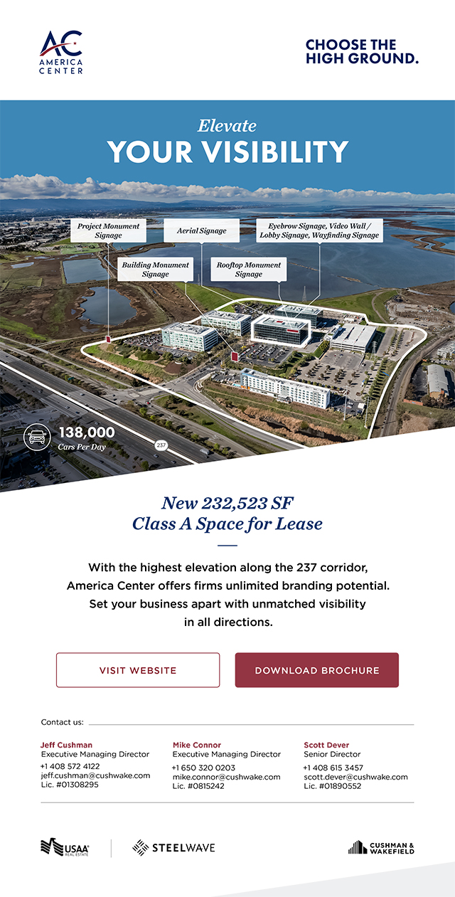
Elevate Your Visibility email campaign showcasing signage opportunities throughout the campus.

Surround Yourself in Amenities email campaign describing the on-site amenities available for tenants.
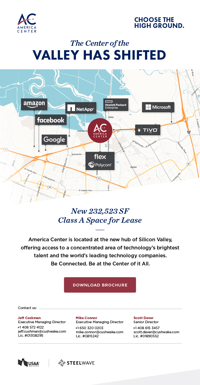
The Center of the Valley has Shifted email campaign.
Print Campaign

A New Perspective page on print brochure.

Back cover of print brochure.
Team
- Client – USAA Real Estate, Steelwave
- Agency – Cushman & Wakefield
- Project Manager – Angie Espejo
- Print Design – Rishad Amarkhel, Gustavo Youngberg
- Email Design – Rishad Amarkhel, Gustavo Youngberg
- Environmental Design – Rishad Amarkhel, Gustavo Youngberg
- Web Design – Gustavo Youngberg
- Web Development – Gustavo Youngberg
- Copy Editor – Angie Espejo
Next Project
Check out another project.