601 City Center
Oakland's New View
Overview
601 City Center is the first high-rise built in Oakland, CA, in more than 15 years. As such, it deserves a debut worthy of its presence and standing as a new iconic mark on Oakland’s skyline.
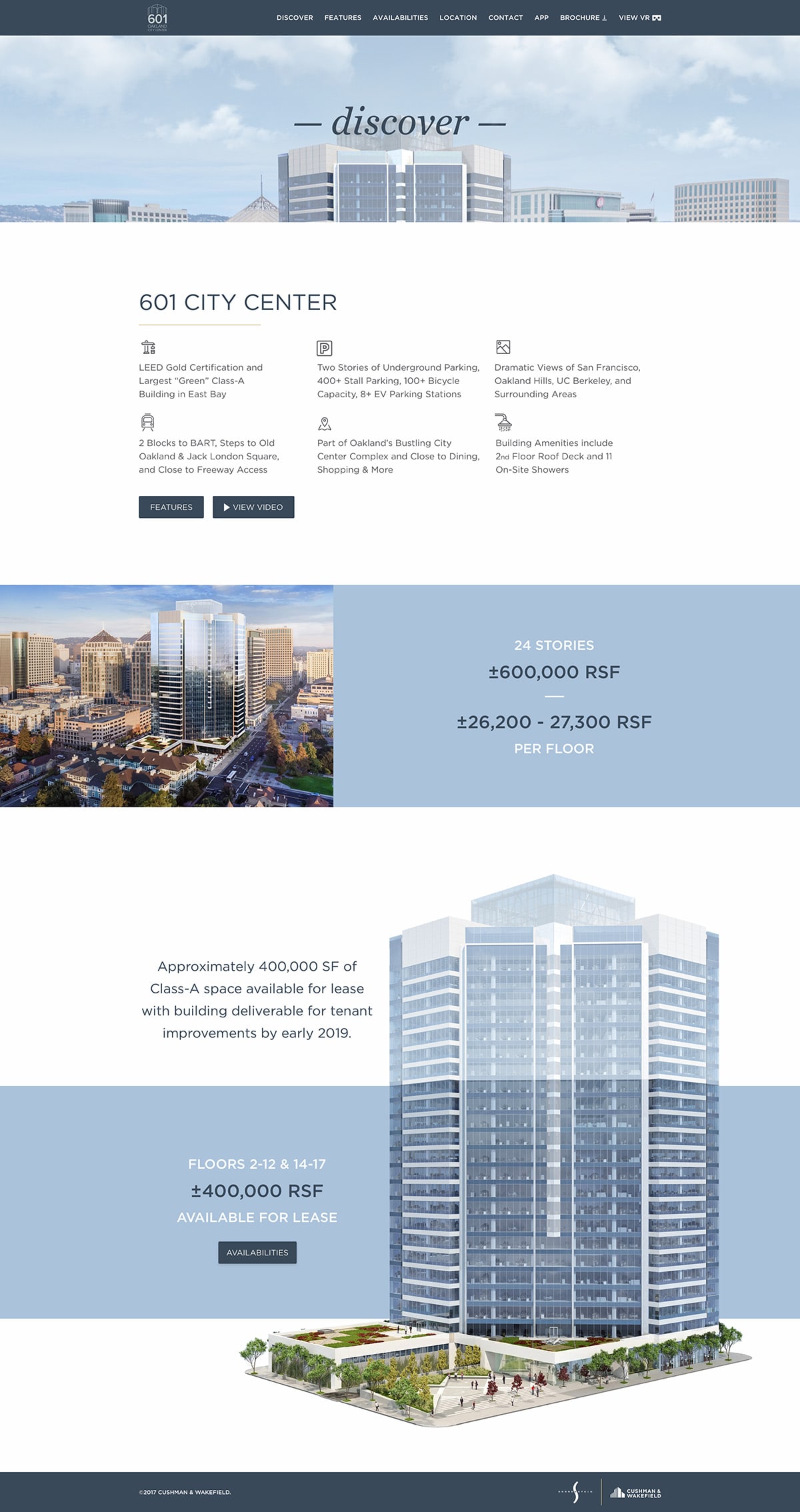
Our San Francisco marketing team at Cushman & Wakefield was tasked with repositioning the project which included a rebrand, print brochure, environmental signage, email campaign, and marketing website.
View Website Skip to Results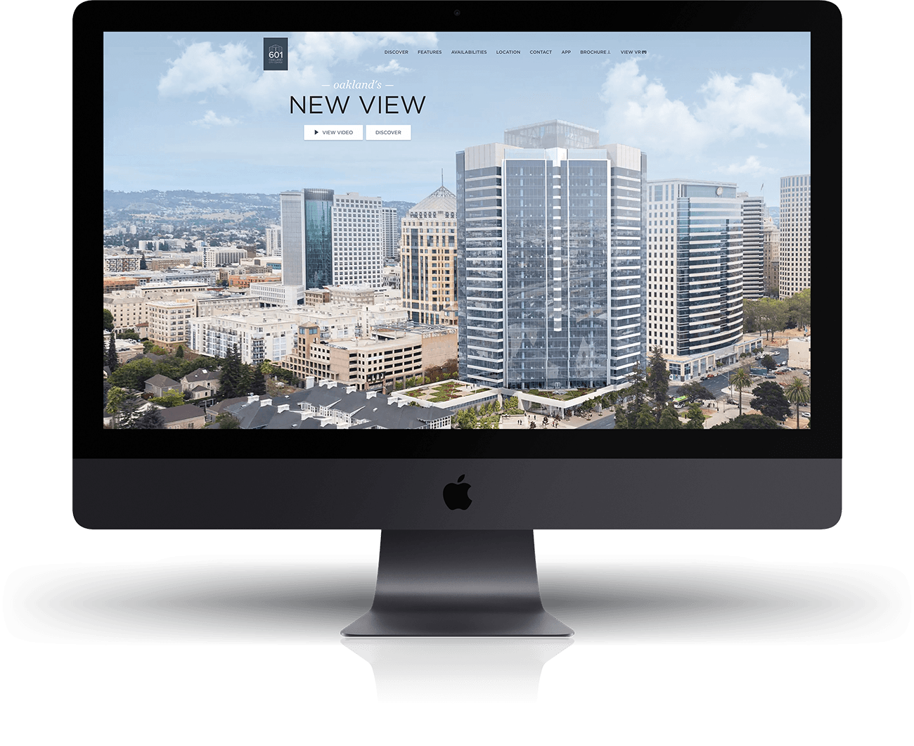
Challenge
Design
The first challenge was incorporating the print design and layout into a full feature website.
Development
The second challenge was ensuring a quick and seamless experience throughout the site without sacrificing accessibility or quality.
Process
Design
Using the print material as a base for the design, I combed through the content and narrowed it down to a 6-page site organized in a way that would guide visitors through the project, ultimately directing them to the availabilities and contact pages.
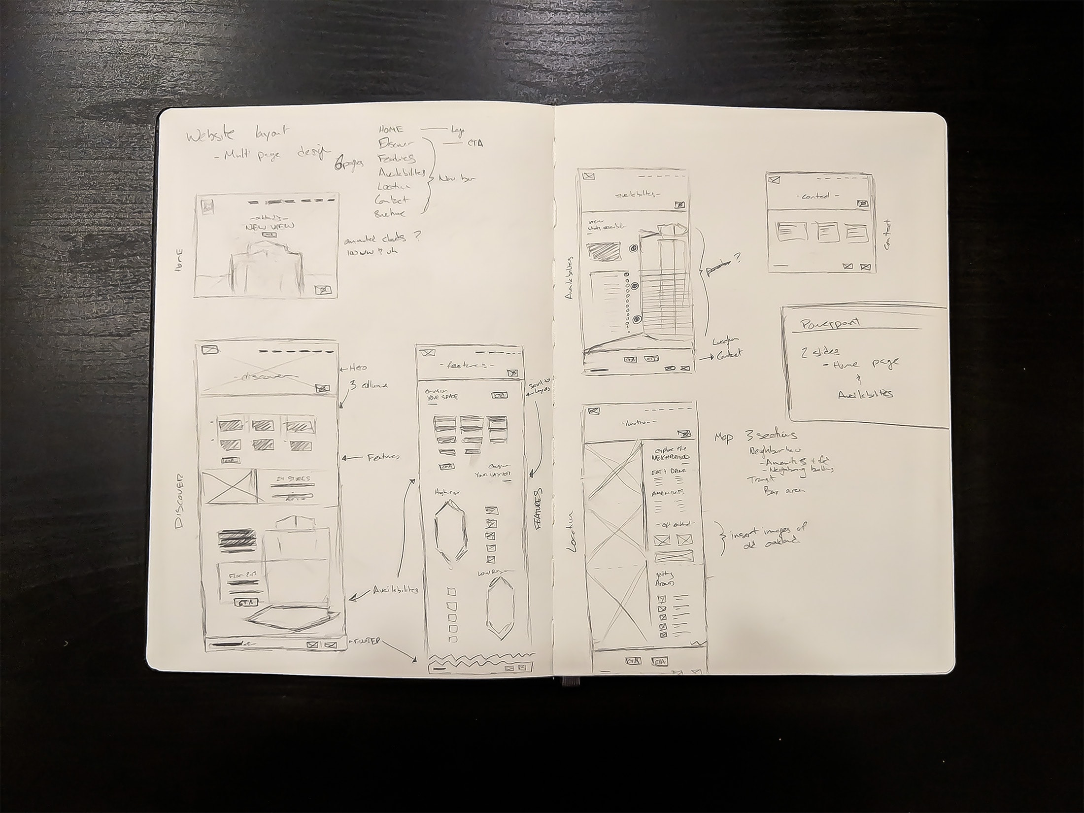
I then moved to create high-fidelity mockups of each page with the intention of creating a static prototype using InvisionApp. This, along with a pdf presentation highlighting the site’s features, was sent to the client for final approval before development.
Development
After approval, I began porting over the content from the mockups and brochure into the HTML. Using Foundation for Sites by Zurb, I built the website beginning with smaller, reusable components using SASS and HTML to expedite development and allow for more time spent solving the harder interactive challenges that each page presented. Specifically the Availability page (shown below) and the Location page. The first posed the challenge of ensuring proper scaling between screen sizes and the latter involved the choreography of scroll events the synchronized movement of the map.
Results
The final result is a high-end website that provides viewers an immersive experience of 601 City Center. Through striking visual details, viewers are transported into the space and better able to envision what it would feel like looking out across the bay.
View WebsiteMobile | Availabilities

Mobile | Features

Mobile | Discover

Desktop | Availabilities

Desktop | Features

Desktop | Discover
Team
- Client – Shorenstein
- Agency – Cushman & Wakefield
- Project Manager – Angie Espejo
- Logo Designer - Ahmed Badenjki
- Print Designer - Ahmed Badenjki
- Environmental Designer - Ahmed Badenjki
- Presentation Designer - Maia Pineiro
- Email Designers - Gustavo Youngberg, Maia Pineiro
- Web Design – Gustavo Youngberg
- Web Development – Gustavo Youngberg
- Copy Editor – Angie Espejo
Awards
- Awwwards Google Mobile Excellence ‘18
- Awwwards Nominee ‘18
- DreamHost Dreamies ‘17 — Overall Design Award
- Cushman & Wakefield Best-in-Class ‘18 — Innovative Campaigns & Solutions
Next Project
Check out another project.
