Challenge
In early 2021 our company was gearing up to launch several new product offerings. I was tasked with redesigning our existing landing page and creating additional pages for each product offering. The design and aesthetic of the existing landing page was a mix of styles and ideas, designed during our initial launch from stealth. With the expansion of product offerings, a new and cohesive set of elements would be needed to illustrate these offerings.
This project was our last opportunity to develop and finetune our marketing language before making our appeal to a broader audience. To overcome this challenge I needed to establish a design language separate from our product language that would work with our product.
Role
Visual Designer / UI/UX Design / Copy Writer
Process
Using our existing landing page, I partnered with our CEO to create an outline of copy for each product offering. Once we had iterated over the copy to create a rough draft, I began organizing content into page and section level blocks. I used these blocks to pull themes and began sketching out visualizations. I then pulled in content and sketches into low-fidelity mockups to map out shareable components and prioritize which items to design first.
Once a rough list of concepts had been established, I began to destruct our product UI into a simplified abstraction. Using certain shapes (i.e. circles, squares, and crosses) I was able to find patterns that could be reordered and combined in different ways that would become the building blocks of our marketing language.

Results
The result was a new look and feel for our landing pages and a visual foundation for our marketing language. Using the patterns established while drafting content for each page, accent graphics were pieced together using abstracted product UI and iconography to illustrate the concepts in our copy. Circles were used to symbolize people, squares for organizations/entities, and crosses for the data that connects them.
The main landing page for all visitors navigating to our website. This page provides general details on the solutions and use cases our application solves for.
The Flow Services page details the services provided by our Operations team for clients requiring additional support in fundraising.
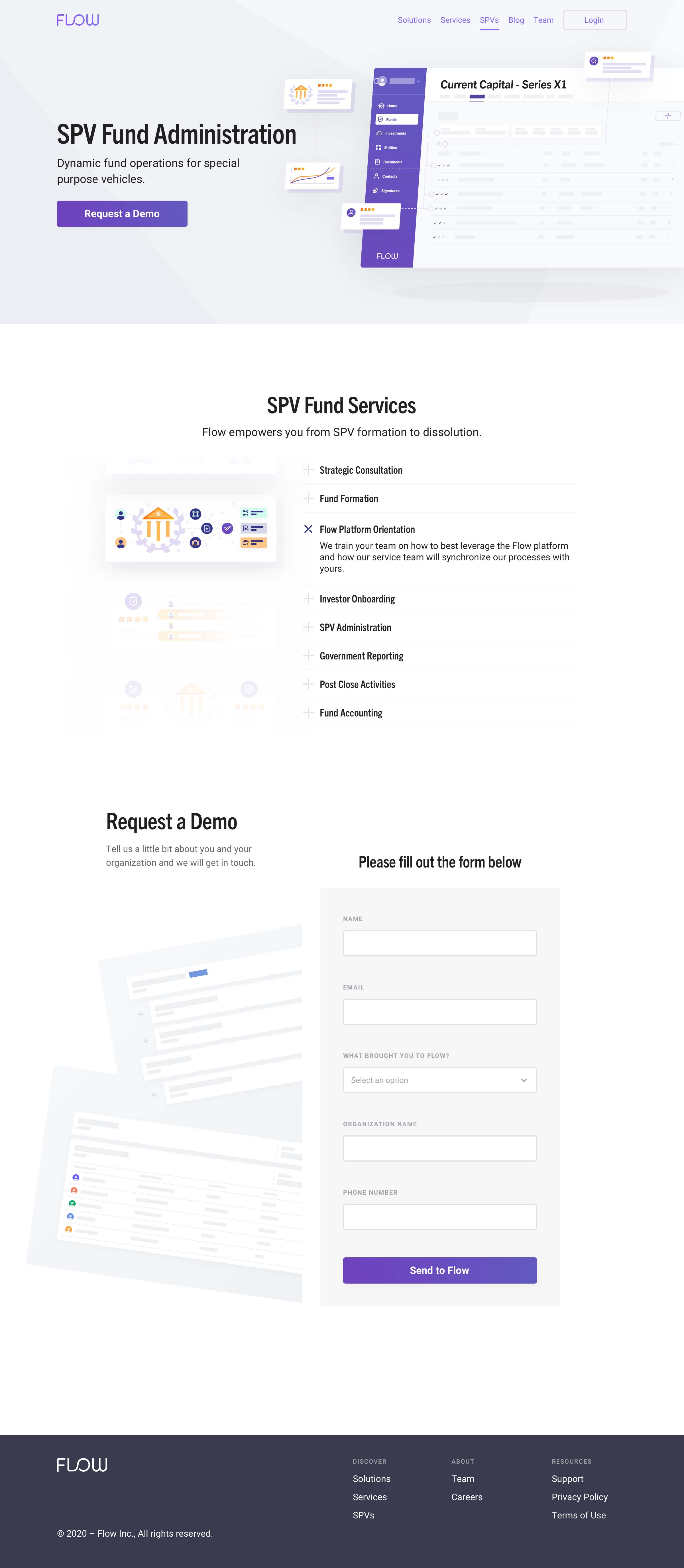
The Flow SPVs page highlights each phase of fundraising that our application solves for.
Illustrations
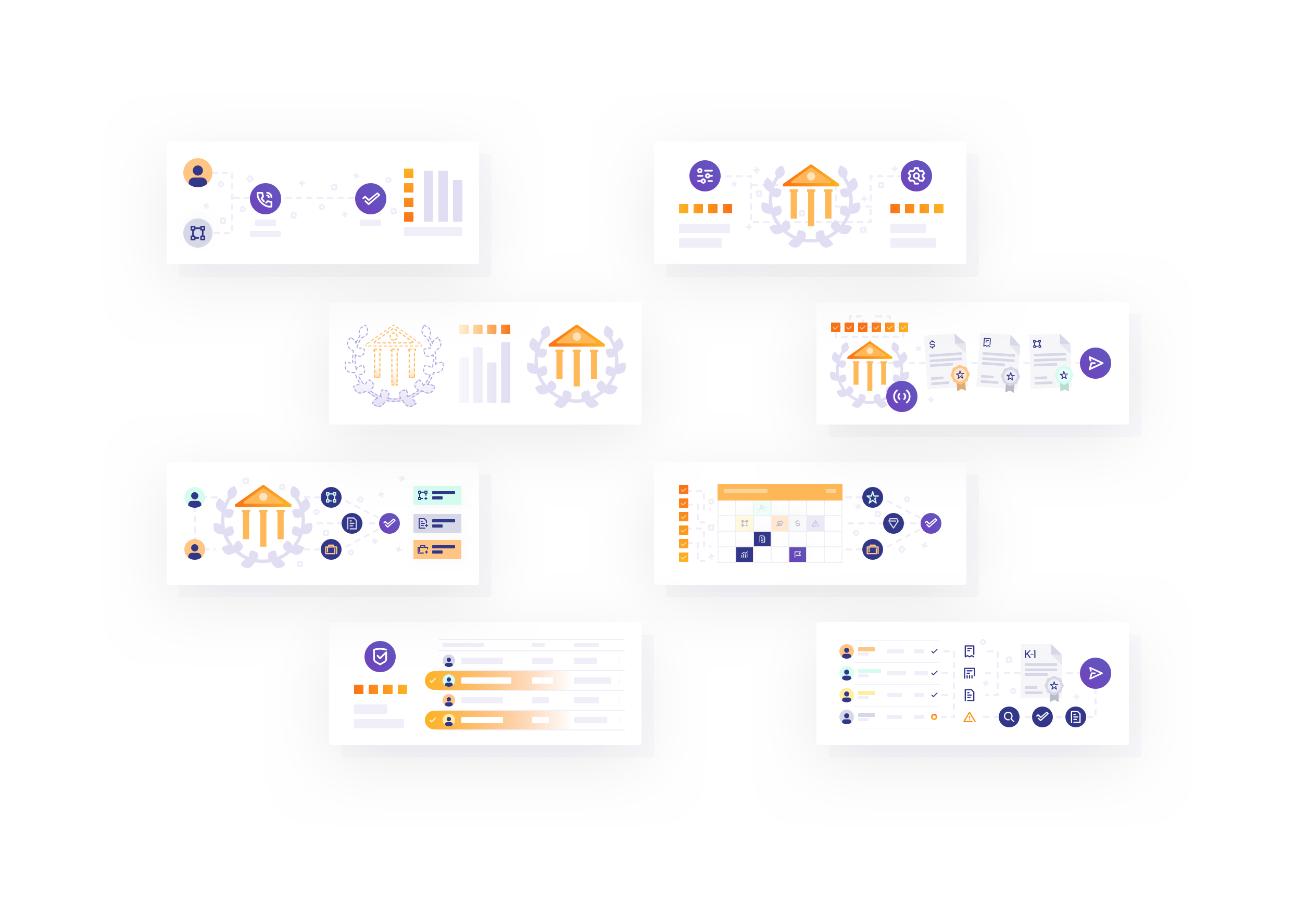
Cards are used heavily within our product design to symbolize objects. We drew on this to illustrate different concepts and ideas. The cards shown here illustrate each phase of SPV fundraising the Flow application integrates into.
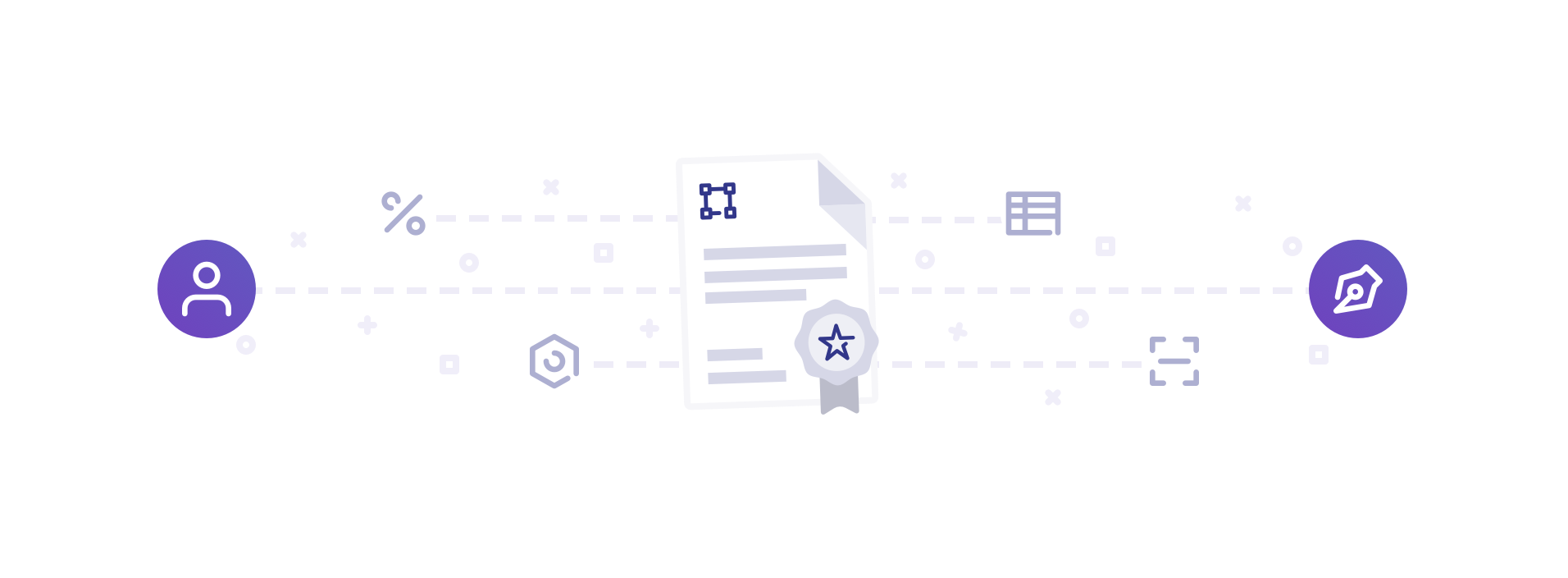
In many of our more complex illustrations we used iconography from our product design with circles, squares, and crosses. These would be combined with illustrations of documents to symbolize data processing and user interaction with fund documents.
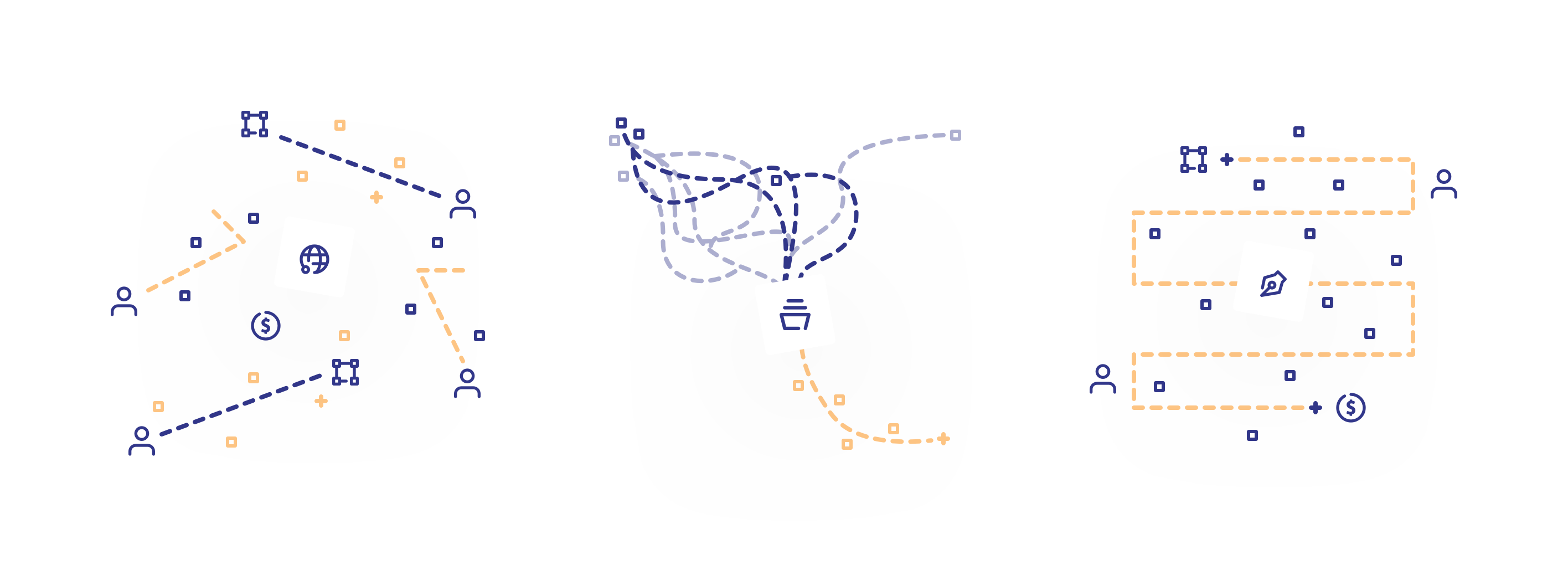
Our simpler illustrations used only icons, circles, squares, crosses, and lines. These illustrations depict from left to right: people and entities sharing information and data, data from complex systems being simplified using workflows, and the steps an entity takes interacting with user's data and signatures to receive wires.